
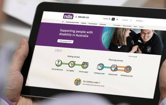
A website is often one of the first places people visit when searching for disability support services. Participants, family members, carers, and support coordinators may use it to understand available services, check service areas, learn about a provider, or make an enquiry. If that experience is confusing or difficult to navigate, important information can become unnecessarily hard to access.
Effective NDIS website design should therefore go beyond creating an attractive online presence. It should focus on accessibility, clarity, usability, and a straightforward journey that allows different users to find the information they need with minimal effort.
Accessibility Should Influence The Entire Design
Accessibility works best when it is considered from the beginning rather than added after a website has already been created. Design choices involving text, navigation, forms, images, buttons, and page structure can all affect how easily someone interacts with a website.
Readable fonts and appropriate text sizing can make written information easier to follow. Strong contrast between text and backgrounds can improve visibility, while descriptive headings help users understand how information is organised.
Designers should also consider people who navigate websites using keyboards or assistive technologies. Images that communicate meaningful information should have appropriate alternative text, while links and buttons should clearly describe their purpose. These details contribute to an experience that is more inclusive for a wider range of visitors.
Keep Navigation Predictable And Simple
Complex navigation can create unnecessary barriers. Visitors should not have to search through numerous menus or pages simply to discover what support a provider offers.
A clear menu structure can organise information around the questions visitors are likely to have. Pages covering services, about information, locations, contact details, and frequently asked questions can provide obvious pathways through the website.
Consistency is equally important. Navigation elements should behave similarly across different pages so visitors do not need to relearn how the website works whenever they move to another section.
Make Service Information Easy To Understand
Disability support can involve terminology that is familiar to providers but less familiar to participants or family members. A website overloaded with technical or administrative language may make services harder to understand.
Good NDIS website design creates space for plain, direct communication. Instead of simply naming a service, a page can explain what the service involves, who it may be relevant to, and what someone can expect when contacting the provider.
Short paragraphs, meaningful headings, and logically grouped information can also improve readability. Visitors should be able to scan a page and understand its main message without needing to read every sentence.
Design For Different Ways Of Accessing Information
Not everyone visits a provider website from a desktop computer. Some people may browse from a phone or tablet, particularly when searching for services while away from home.
Responsive design allows pages to adjust to different screen sizes. Text should remain readable, menus should remain easy to operate, and buttons should be large enough to interact with comfortably.
Mobile design should not feel like a reduced version of the main website. Important information such as service details and contact options should remain readily available regardless of the device being used.
Reduce Friction Around Enquiries
Once visitors decide they want more information, the next step should be obvious. Complicated forms or difficult-to-locate contact details can interrupt an otherwise positive website experience.
Contact forms can be kept focused on information that is genuinely useful for beginning a conversation. Clear labels can help visitors understand what each field requires, while useful error messages can explain what needs correcting if information has been entered incorrectly.
Providers may also offer several contact options so visitors can choose a method that suits them. The objective is to make communication straightforward rather than forcing everyone through the same process.
Build Confidence Through Consistent Information
Accessibility is closely connected with trust. Visitors need to understand who the provider is, what services are offered, and how they can get further information.
Consistent branding, accurate contact information, clear service descriptions, and transparent explanations of the provider’s approach can create a more professional digital experience. Authentic photographs and useful information about the organisation may also help visitors become familiar with the provider before making contact.
The website should avoid making visitors work to verify basic information. Important details should be presented clearly and placed where users would naturally expect to find them.
Review Accessibility As The Website Changes
Websites are rarely static. Providers may introduce new services, update locations, add team members, or publish additional resources. Every change creates another opportunity to maintain or improve accessibility.
Regular reviews can identify issues such as broken links, outdated information, unclear page structures, or content that has become difficult to navigate. Testing across devices and considering how different visitors interact with the site can reveal problems that may not be obvious during everyday administration. Accessibility should therefore be viewed as an ongoing responsibility rather than a single design task.
Creating A More Inclusive Online Experience
A strong NDIS provider website should help people reach useful information without unnecessary digital obstacles. Clear navigation, accessible content, responsive layouts, understandable service explanations, and simple contact pathways all contribute to that goal.
Thoughtful NDIS website design brings these elements together to create an experience centred on the people using the website. When accessibility guides both design and content decisions, a provider’s online presence can become more welcoming, practical, and useful for participants, families, carers, and the wider support network.
