
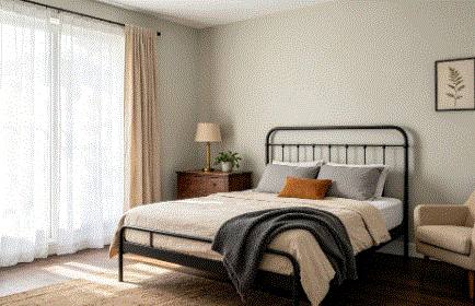
Classic Gray OC-23 looks like it should be the easiest pick in the world — barely-there gray, light, neutral, done. But the undertones have a way of catching people off guard. I’ve used it in three rooms now, and each one taught me something new about this color. Here’s the real story.
What Is Classic Gray OC-23?
Classic Gray is a very light warm gray from Benjamin Moore with an LRV around 74. That’s high enough to function almost like a white in bright rooms but with just enough gray to give the walls some depth. It sits right at the line between off-white and light gray — you can see it’s a color, but just barely.
It’s one of BM’s most popular neutrals and shows up constantly in whole-house projects. The appeal is that it adds the faintest warmth and softness without looking beige, cream, or dingy. On the chip it reads as safe and simple. On the wall, the undertones start revealing themselves — and that’s where it gets interesting.
What Undertones Does Classic Gray OC-23 Have?
Classic Gray has a warm base with a violet undertone hiding underneath. Most of the time the violet stays quiet and the color reads as a clean, gently warm gray. But certain conditions pull it forward.
Cool light, gray flooring, and blue-toned decor can all coax that violet to the surface. When it shows up, it’s not dramatic — more like a soft lavender-gray cast that you notice once and then can’t unsee. In warm light surrounded by warm finishes, the violet retreats and Classic Gray acts like a perfectly behaved neutral. Some people also catch a faint green in certain rooms, but the violet is the undertone that surprises most buyers. If you’re sensitive to purple shifts, test carefully.
Classic Gray vs. Pale Oak — Which Should You Pick?
Pale Oak OC-20 is the comparison that comes up every time. Both are light, warm-leaning BM neutrals with devoted followings. But on the wall, they head in different directions.
Pale Oak is warmer and more beige. It leans into a pink-peach undertone and reads as a creamy off-white. Classic Gray is cooler and leaner — more gray, less beige, with that violet lurking instead of pink. I put both side by side on Paintuma on a real wall photo, and the temperature difference was clear. Pale Oak felt like a warm embrace. Classic Gray felt quieter and more reserved. If you want warmth, Pale Oak wins. If you want a neutral that doesn’t push warm or cool too hard, Classic Gray is the better call.
How Does Classic Gray Look in Different Lighting?
South-facing rooms are the sweet spot. Warm natural light keeps Classic Gray looking balanced and neutral. The violet stays hidden, a gentle warmth comes through, and the color does exactly what the chip promised.
North-facing rooms are where it gets dicey. Cool indirect light draws the violet forward, and Classic Gray can start reading slightly purple-gray instead of clean neutral. It’s subtle enough that some people don’t mind. Others can’t live with it. East-facing rooms shift through the day — cooler mornings, warmer afternoons. West-facing rooms glow warm by evening, and the color looks its best at sundown.
For bulbs, 3000K LEDs hit the balance point. Drop to 2700K and it pushes slightly yellow. Cool daylight bulbs above 4000K wake the violet right up.
Does Classic Gray OC-23 Work on Exteriors?
It can, but at LRV 74, direct sunlight washes most of the gray out. In full sun, Classic Gray reads very close to white. You’ll lose the subtle warmth and depth that make it appealing indoors.
Shaded walls and covered porches tell a different story — the gray shows up more and the warmth comes through. For houses with heavy tree cover or north-facing facades, it works as a soft, warm exterior white. But if your siding gets full sun most of the day, Classic Gray will just look like a slightly warm white, and there are simpler ways to get that result. Something with more depth — Pale Oak OC-20 or Edgecomb Gray HC-173 — will hold its character better under direct light.
What Trim Color Pairs Best With Classic Gray?
Chantilly Lace OC-65 is my first pick. It’s a true white with no competing undertone, so it gives Classic Gray clean contrast and lets the walls read as a definite color against the trim. The pairing is crisp without being cold.
White Dove OC-17 works if you want a softer transition. It’s a warm white that blends more gently — the contrast is subtle, but the effect feels cozy. Simply White OC-117 splits the difference. I slid Classic Gray OC-23 next to several trim options on Coloraw to compare, and Chantilly Lace gave the sharpest definition while White Dove felt the warmest. Both work — it depends on whether you want the trim to pop or to flow.
What Are the Closest Matches From Other Brands?
Sherwin-Williams Eider White SW 7014 is the most commonly cited cross-brand match. It’s a warm light gray in a similar LRV range with a comparable violet-pink undertone. The two are close, but Eider White can lean slightly pinker in some conditions while Classic Gray holds more pure gray.
Sherwin-Williams Agreeable Gray SW 7029 enters the conversation too, but it’s noticeably darker — LRV around 60 — and warmer. It’s a different color class entirely. For Behr, a few of their light gray off-whites land in a similar range, but I haven’t found one that matches Classic Gray’s specific undertone balance. If you need a match at another store, bring a large painted sample board rather than a chip. Colors this light are almost impossible to match from tiny swatches.
Should You Sample Classic Gray OC-23 Before Buying?
Don’t skip it. Classic Gray is light enough that you might assume it’s safe no matter what, but the violet undertone means it reacts to your specific room more than you’d expect. What looks perfect at your neighbor’s place might read completely different in yours.
Paint a large swatch — at least a foot square — on two walls in the room. Live with it for two full days. Watch it in morning light, afternoon sun, and at night under your regular lamps. Pay attention to what’s on the floor and what color your furniture runs — everything around it influences which undertone comes forward.
For a quick preview before you buy, paintcolorvisualizer.com lets you upload a photo of your own room and test the color for free. It works for interior and exterior shots. It won’t replace real paint on the wall, but it’ll flag a mismatch before you commit.
Bottom line: Classic Gray OC-23 is a barely-there gray that works as a whole-house neutral when the light cooperates. Respect the violet undertone, test it in your actual room, and pair it with a clean white trim for the best result.
